COzy Sips
Graphic Design assignment - Farmingdale State College
Fall 2025
OverView
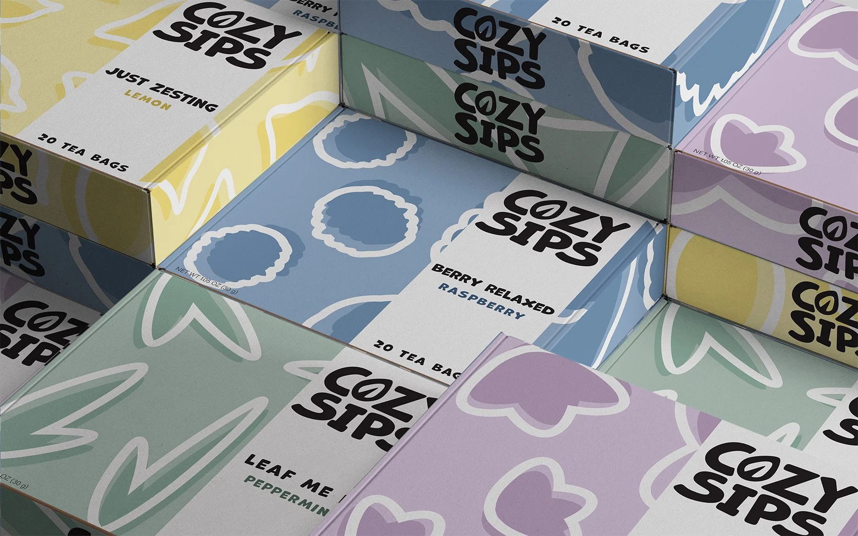
The project brief was to create a brand identity and packaging for a tea company that doesn’t want to look traditional, overly delicate, or elaborate. The target audience for Cozy Sips are relaxation cravers, ages 35–55, who look for ways to unwind after a stressful day.
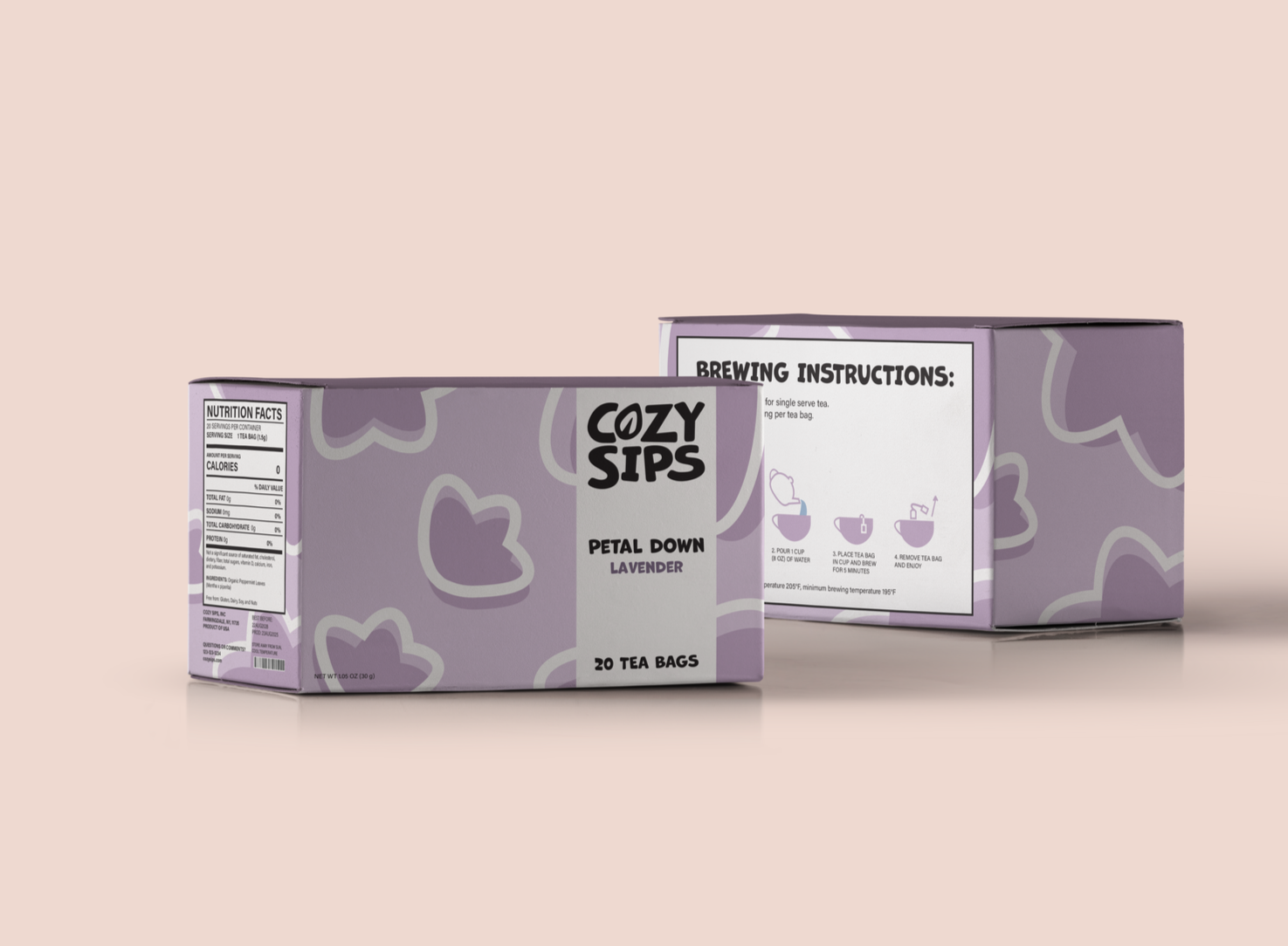
Cozy Sips main goal is to reduce stress and create small moments of comfort in throughout the day. They wanted their brand to reflect that to better resonate with their target audience. The deliverables were four product package variations, a supermarket sell sheet, and a supermarket shelf ad.
My role
Brand design - Brand research and strategy - Brand identity - Package design - Art direction - Copywriting.
software
Adobe InDesign - Adobe Illustrator
Design Story
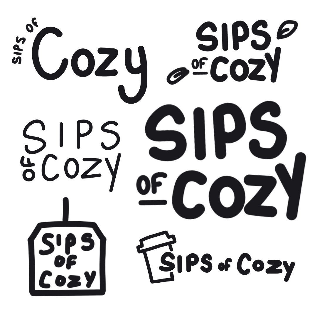
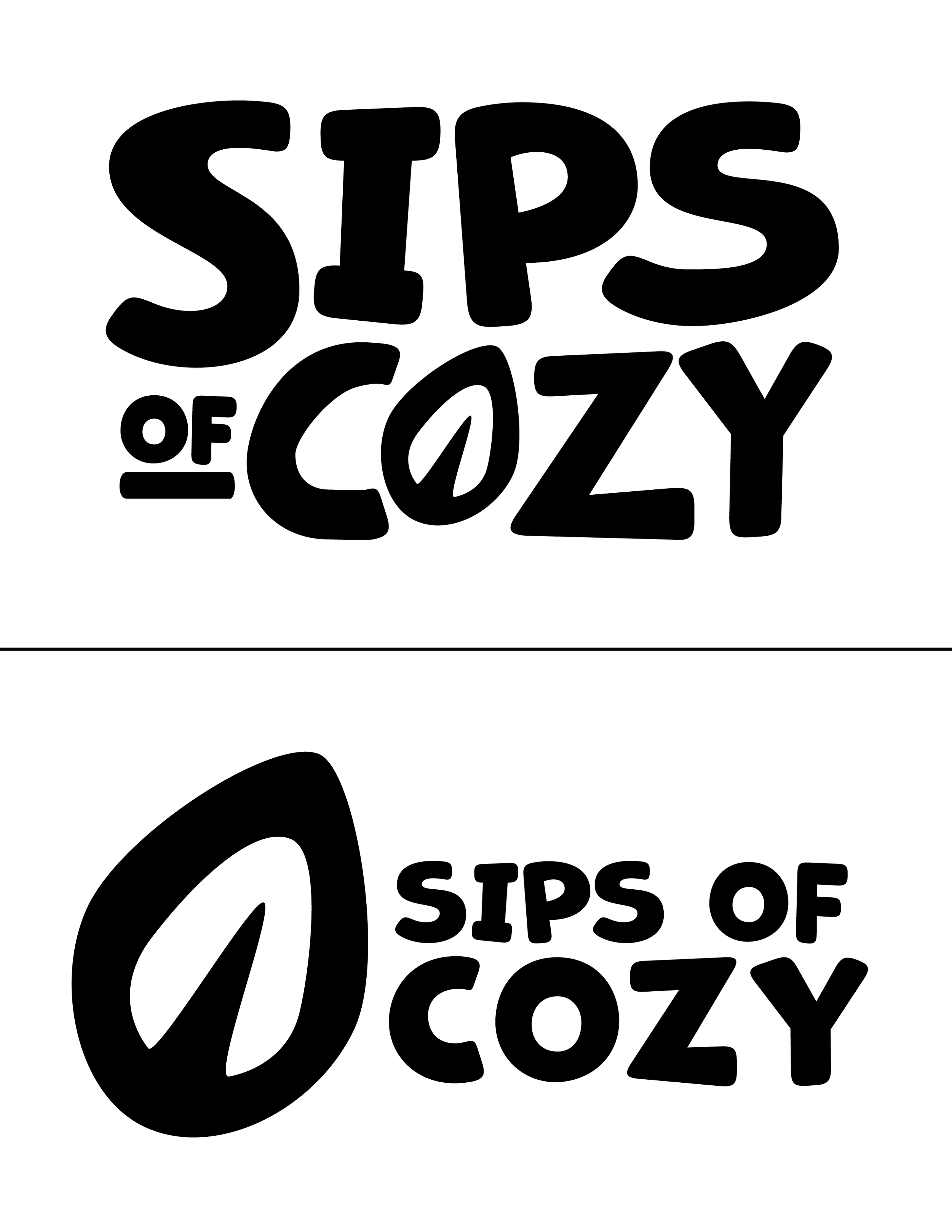
I approached the problem by doing thorough research on the target audience as well as on visuals that create comfort and relaxation. After my research I brainstormed ideas through mood boards, sketches, and word associations. I then developed variations of visual directions such as color palettes, logos, brand names, and fonts. Through feedback, I refined the strongest and most successful variation and created the final design for Cozy Sips that communicates their brand’s goal.
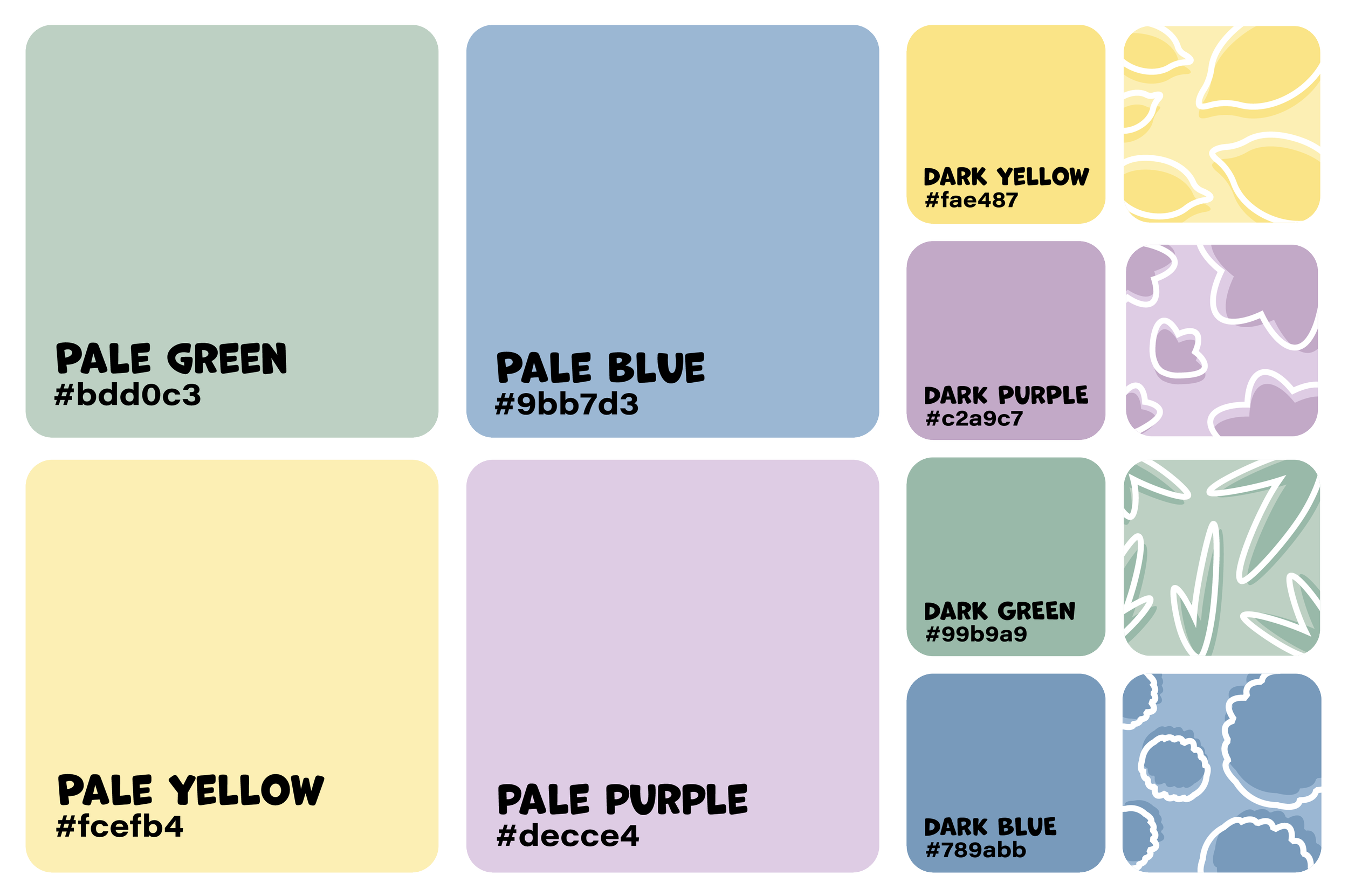
brand colors & Patterns
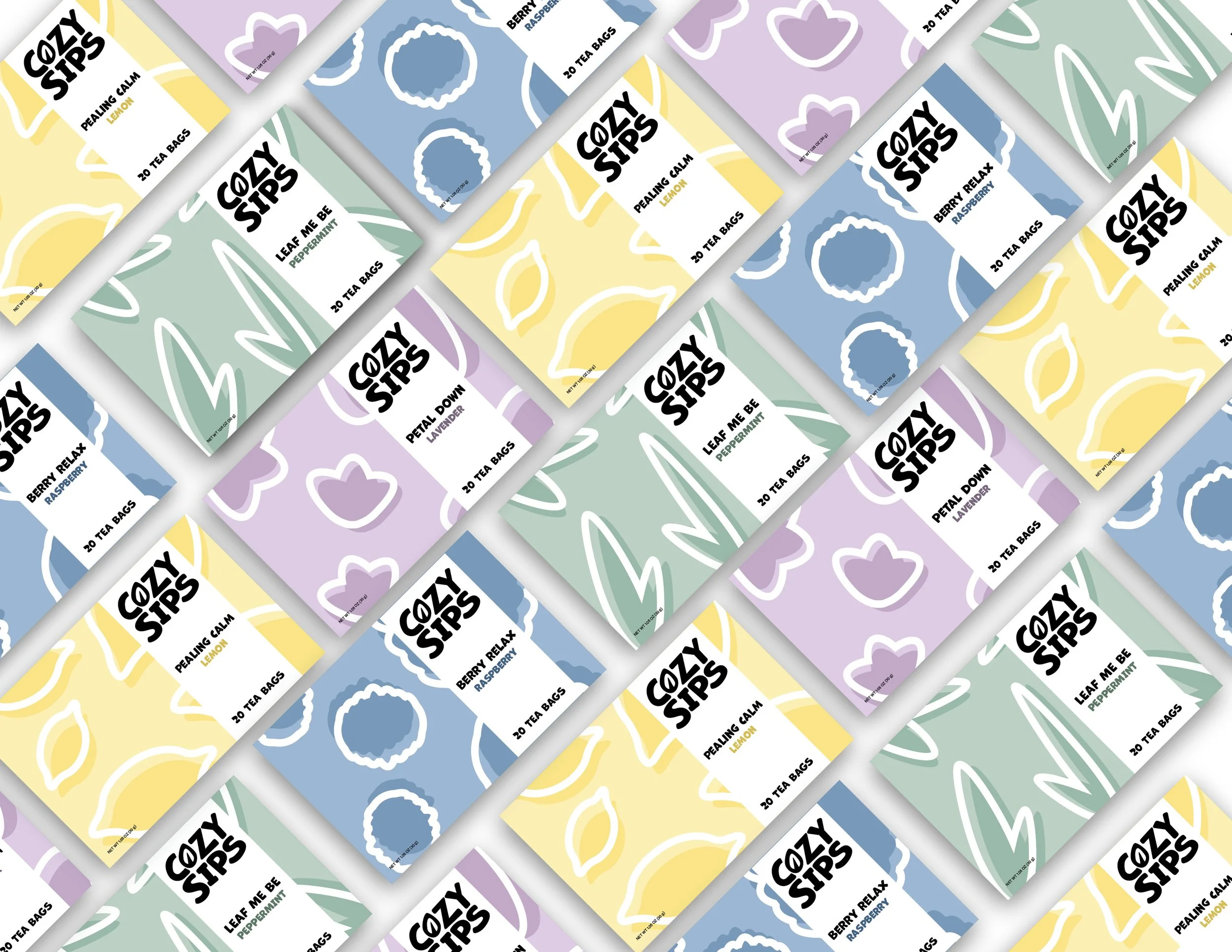
The Cozy Sips color palette reflects the brand’s calm, comforting personality. The soft, muted tone creates a relaxing feel without overwhelming the eye, while the darker secondary colors add a subtle contrast while remaining visually consistent. Together, this color palette supports the brand’s focus on relaxation.
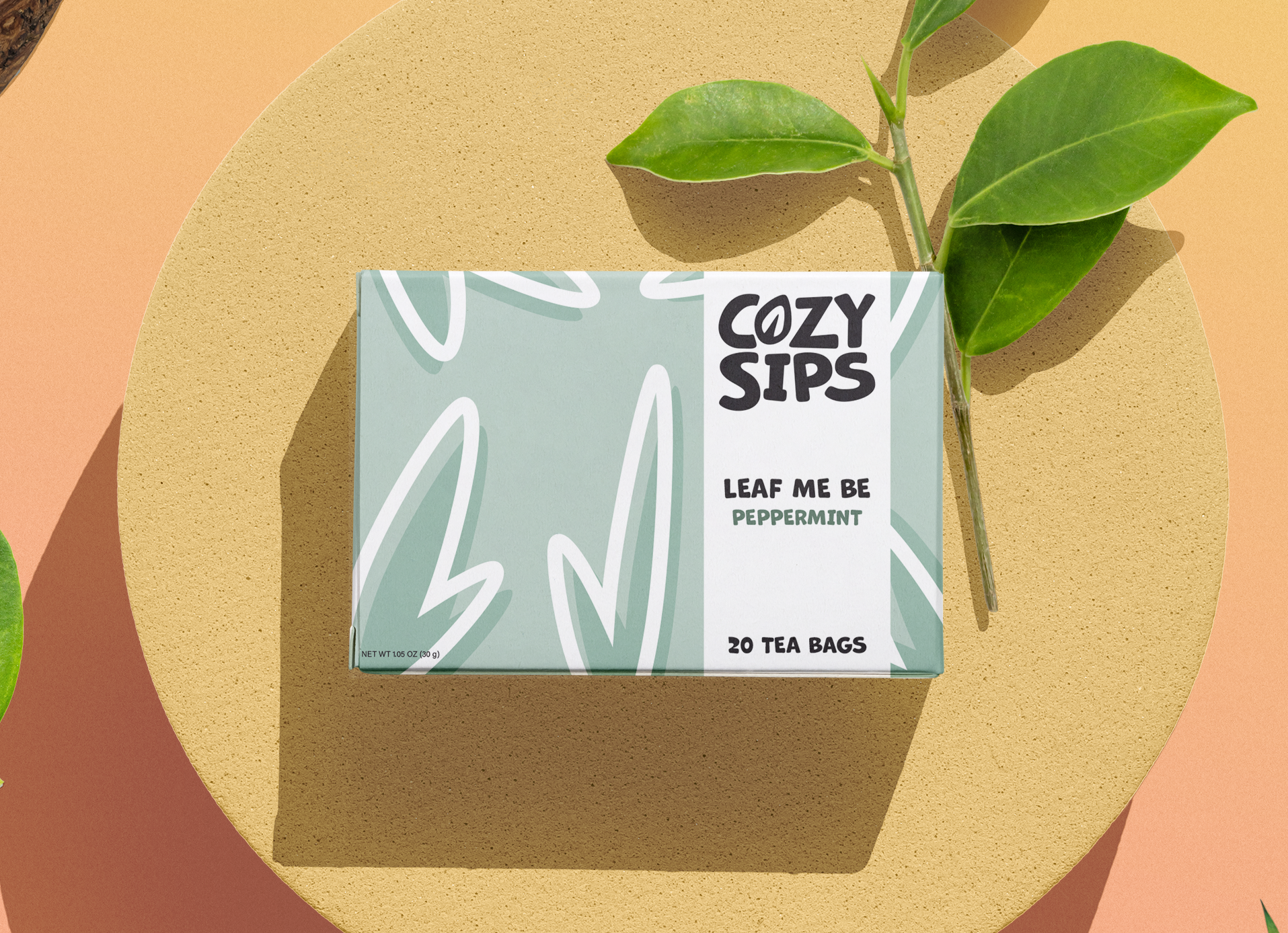
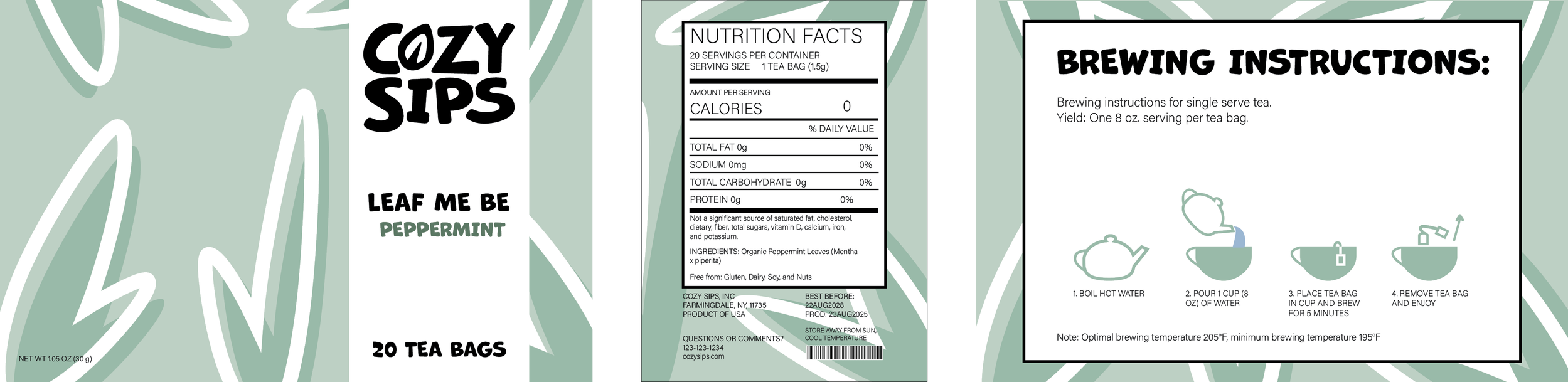
Cozy Sips packaging features flavor-based pattern variations. They were designed to evoke a sense comfort, mimicking a blanket or wallpaper pattern style. The repetition of flavor-based shapes was done intentionally to evoke relaxation. The variation in sizes keep the design cohesive without feeling busy, reinforcing the brand’s simple, calming aesthetic.

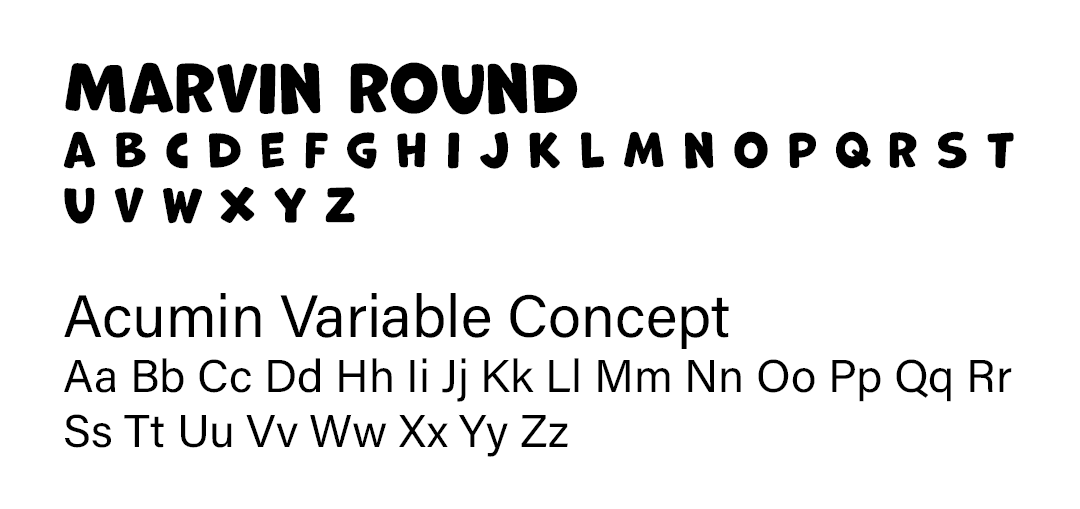
brand Logo
The logo uses Marvin Round, whose soft, rounded edges create a sense of comfort. Its bold, varied line weight adds a hand-drawn feel while helping the logo stand out against the patterned packaging. The larger type size naturally draws the viewer’s eye first, reinforcing brand recognition and hierarchy.
The Cozy Sips logo features a leaf, referencing tea leaves used in brewing. Its hand-drawn style, is inspired by Marvin Rounds, which keeps the logo design consistent.
Sell Sheet
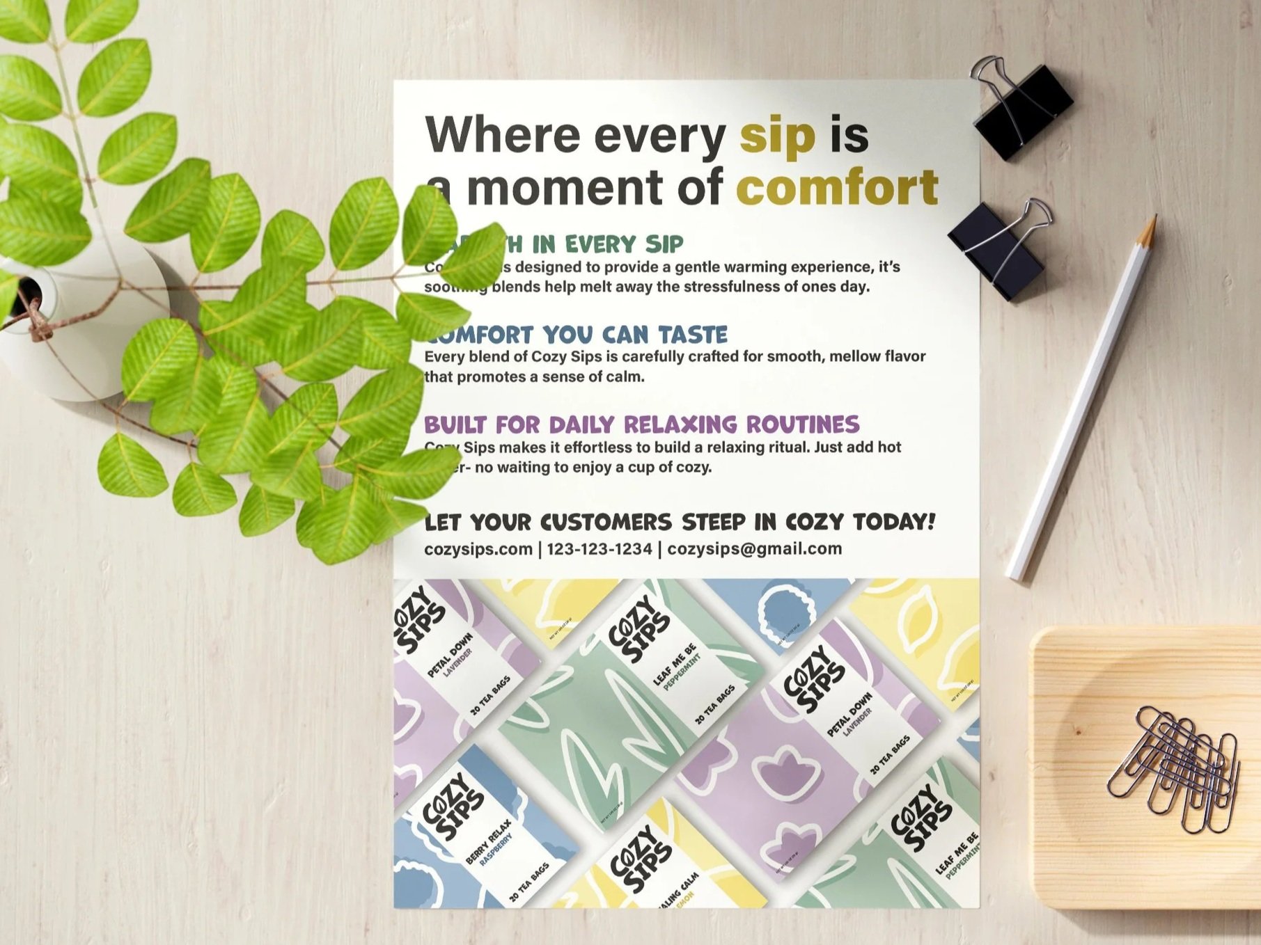
The goal of the sell sheet was to maintain Cozy Sip’s visual identity while advertising to supermarkets. I incorporated the brand’s color palette and typography to ensure visual consistency across the design. To strengthen the messaging, I also tied the selling points back to Cozy Sip’s brand identity. By using key words developed through my word association brainstorming process, I was able to helping create an intentional narrative with Cozy Sips brand identity.
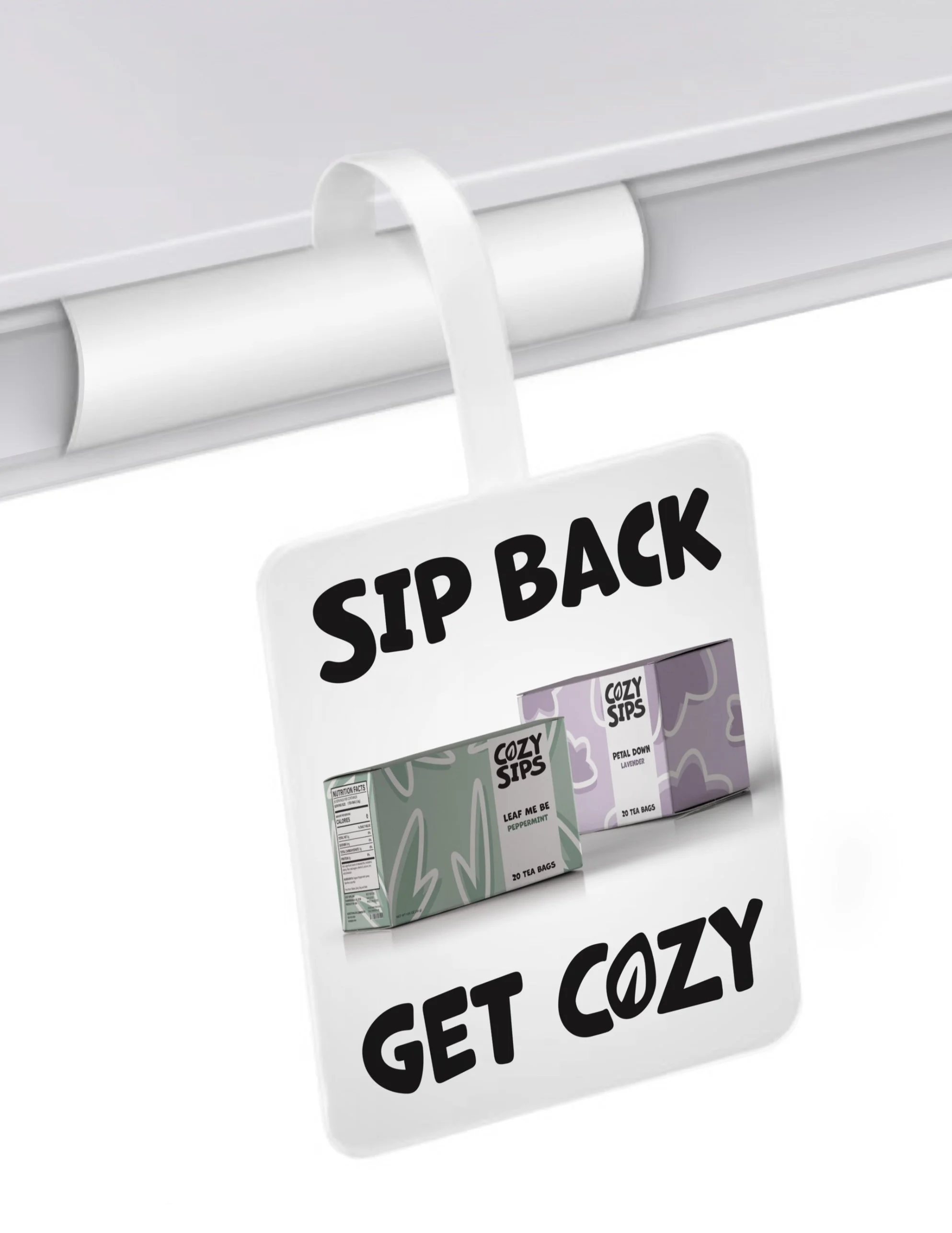
Shelf Advertisement
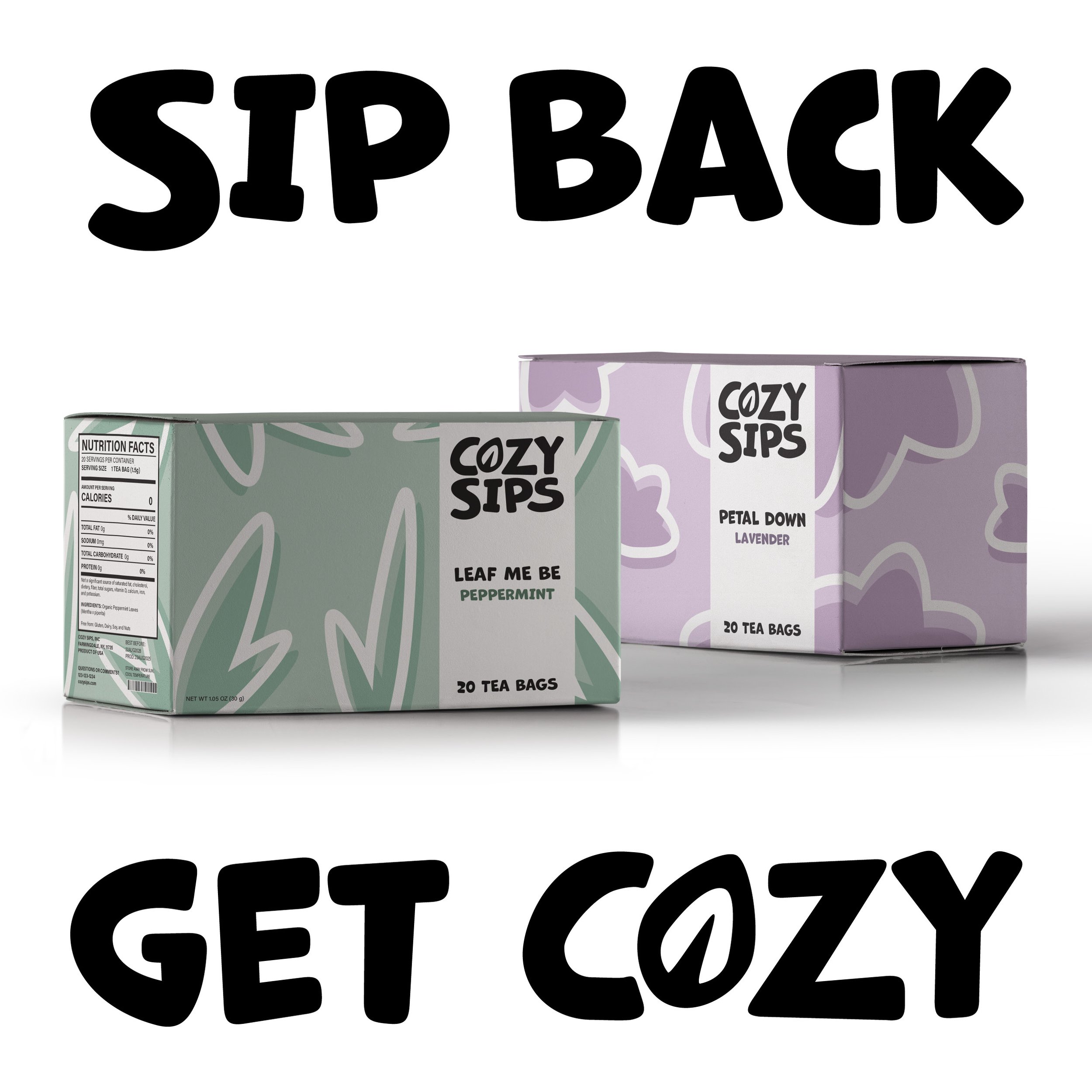
The body copy in the advertisement was kept short and direct to reinforce the brand’s message of tea as a tool for relaxation. The subtle play on words mirrors the brand’s flavor-driven copy, adding a light and playful tone. The minimal design allows the product to stand out as the main focal point of the ad.